🏛️

The Metropolitan Museum of Art

The Met

Usability Testing

The Met:
Becoming a Member

The Met:
Becoming a Member

The findings of a user testing report were conducted to assess the user experience of becoming a member of The Metropolitan Museum of Art website.

Duration

6 weeks

Duration

6 weeks

Duration

6 weeks

Client

The Metropolitan Museum of Art

Client

The Metropolitan Museum of Art

Client

The Metropolitan Museum of Art

Project Type

UX Design | Usability

Project Type

UX Design | Usability

Project Type

UX Design | Usability

Teammates

Anita Liao

Teammates

Anita Liao

Teammates

Anita Liao

The Metropolitan Museum of Art is one of the world's largest and most prestigious art museums located in New York City. Offering an extensive collection spanning over 5,000 years of art from around the globe, the Met attracts millions of visitors annually. The Met has developed many membership options to enhance visitor engagement and support, providing exclusive benefits and access to its diverse exhibitions, events, and resources.

Overview

The Met: Becoming a Member

One of The Met mission is a commitment to accessibility, education, and engagement with art and culture. The Met offers a membership program designed to provide exclusive benefits and opportunities for its supporters, ranging from access to special exhibitions and events to behind-the-scenes tours and educational programs.

01

Project Background

We focused on evaluating the user experience of becoming a member of The Met's website. Just as the museum aims to provide enriching experiences for its physical visitors, it is equally essential to ensure a seamless and intuitive online experience for those seeking to become members.

02

Limitation

One possible shortcoming of this methodology is its reliance on remote user testing, which may fail to capture the nuances of the in-person user experience. And the participants may feel the social pressure to achieve less than their best when there are moderators present.

03

My Role

During the project, I worked with my teammate Anita Liao to do the user testing. Based on our findings, several recommendations have been proposed to enhance the user experience of becoming a member of the Met's website.

Our Goals

To ensure a seamless and intuitive online experience for those seeking to become members.

Through a series of remote user tests conducted using UserTesting.com, this study aims to identify potential usability issues, challenges, and areas for improvement within the membership options. ​

Understand & Define

By simulating the journey of prospective members navigating the Met's website, the research aims to provide valuable insights and recommendations to enhance the digital user experience.

Synthesis + Analysis

Six remote user tests were conducted to evaluate the process of becoming a member of the Met's website, aiming to identify potential issues and provide actionable recommendations for improvement.

Prototype & Recommendation

Based on these findings, several recommendations have been proposed to enhance the user experience of becoming a member of the Met's website.

Methodology

Research Methodology

The remote user tests were conducted through the UserTesting.com platform in an unmoderated and asynchronous manner.

User Research Objectives

The primary objective is to evaluate the usability and user experience of The Metropolitan Museum of Art's (The Met) website, specifically focusing on the process of becoming a member. Additionally, the research aims to identify user preferences, needs, and potential areas for improvement within the membership sign-up process.

Target Users

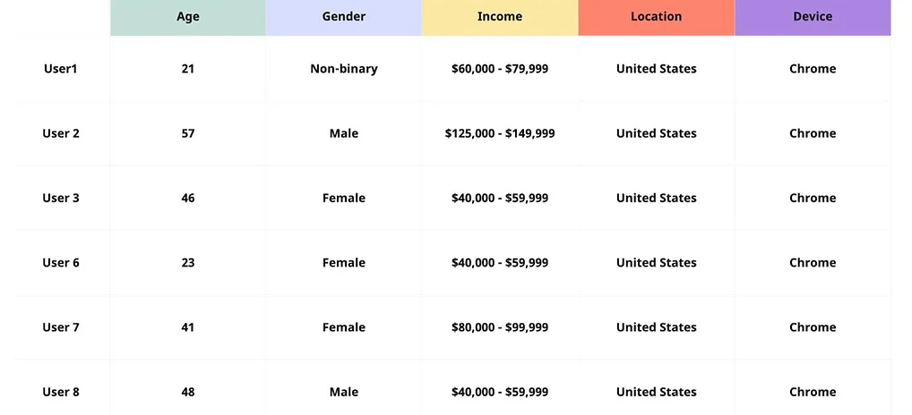
The target users for this research are adults aged 21 and above, with incomes ranging between $40,000 - $149,999. Users should have a general level of computer literacy to navigate the website effectively. We recruits participants from the United States to ensure a feasible representation of potential users.

Limitations

One potential limitation of this methodology is the reliance on remote user testing, which may not fully capture the nuances of the in-person user experience. While remote testing offers the advantage of convenience and accessibility, it may lack the context and environmental factors that could influence user behavior and perceptions (Usability.gov, 2013). For example, participants may encounter technical issues or distractions in their own environments that could impact their ability to complete tasks accurately or provide thorough feedback.

User Testing

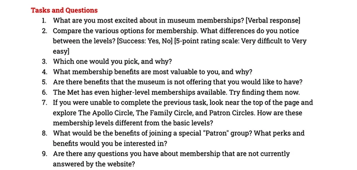
Participants who meet the screening criteria, including age, income, location, and education level, are eligible to participate in the study. During the user testing process, participants were encouraged to provide verbal feedback while completing assigned tasks on the website. They were asked to rate the difficulty of each task on a scale from 1 to 5. Additionally, brief follow-up questions were asked after each task.

Evaluation

The data collected from participants, including screen recordings, and verbal feedback, were analyzed by the research team to identify usability issues, user preferences, and areas for improvement within the membership purchase process on the Met's website. The findings of the research informed actionable recommendations to enhance the digital user experience and support increased membership engagement with the institution.

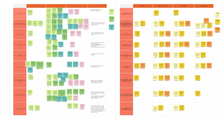
We used the affinity map to identify user's behavior patterns. The methodology adheres to best practices in usability testing to ensure unbiased results.

Insights

Key Insights from Research

Through the user testing process, several key insights and challenges were identified. These include:

Navigation and Accessibility

Navigation and Accessibility

Navigation and Accessibility

Clarity and Transparency

Clarity and Transparency

Clarity and Transparency

Uncertainty in Making Membership Decisions

Uncertainty in Making Membership Decisions

Uncertainty in Making Membership Decisions

Findings

Findings

Based on the feedback provided by the users, several overarching problems can be identified.

Finding 1

Navigation

Users encountered issues with membership option navigation and presentation, including confusion about the order of membership tiers and difficulty accessing relevant information. Some users find it difficult to find higher-level memberships, which do not seem to have the same hierarchy as the basic membership. Users encountered confusion when navigating between different circles and levels due to the naming and grouping of membership tiers.

Finding 2

Membership Tier Differentiation

Users noted that benefits across membership tiers were not significantly differentiated, making it hard to justify the premium memberships. Unclear labeling and insufficient information about benefits, restrictions, or terms lead to frustration. Users struggle to compare features, and benefits. ​​

Design Thinking

Design Principles

We keep the design dialogue, to ensure that we use the following directions of design principles.
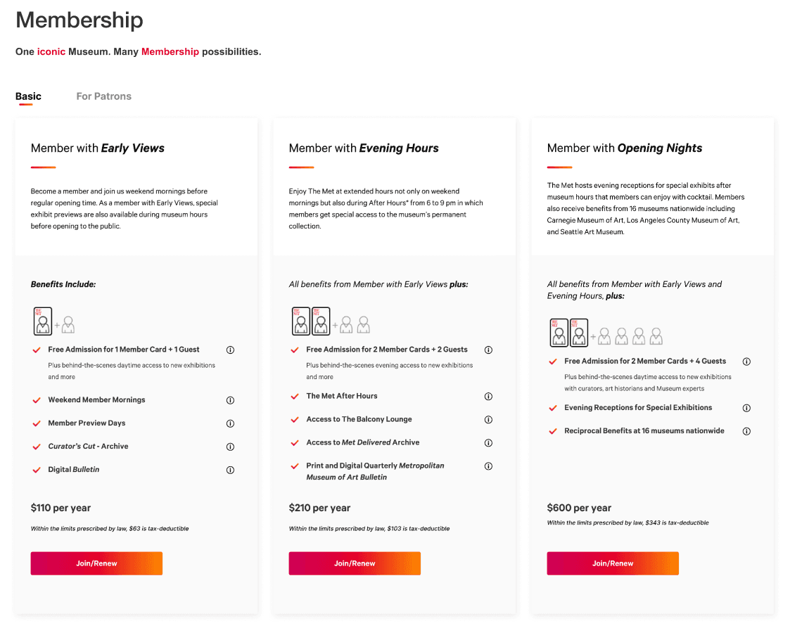
Consistency

Distinctive Visual Design and Consistent Layout

Clear Hierarchy

Concise and Descriptive titles

Clarity

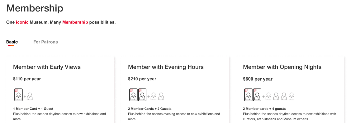
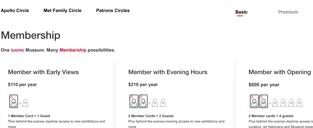
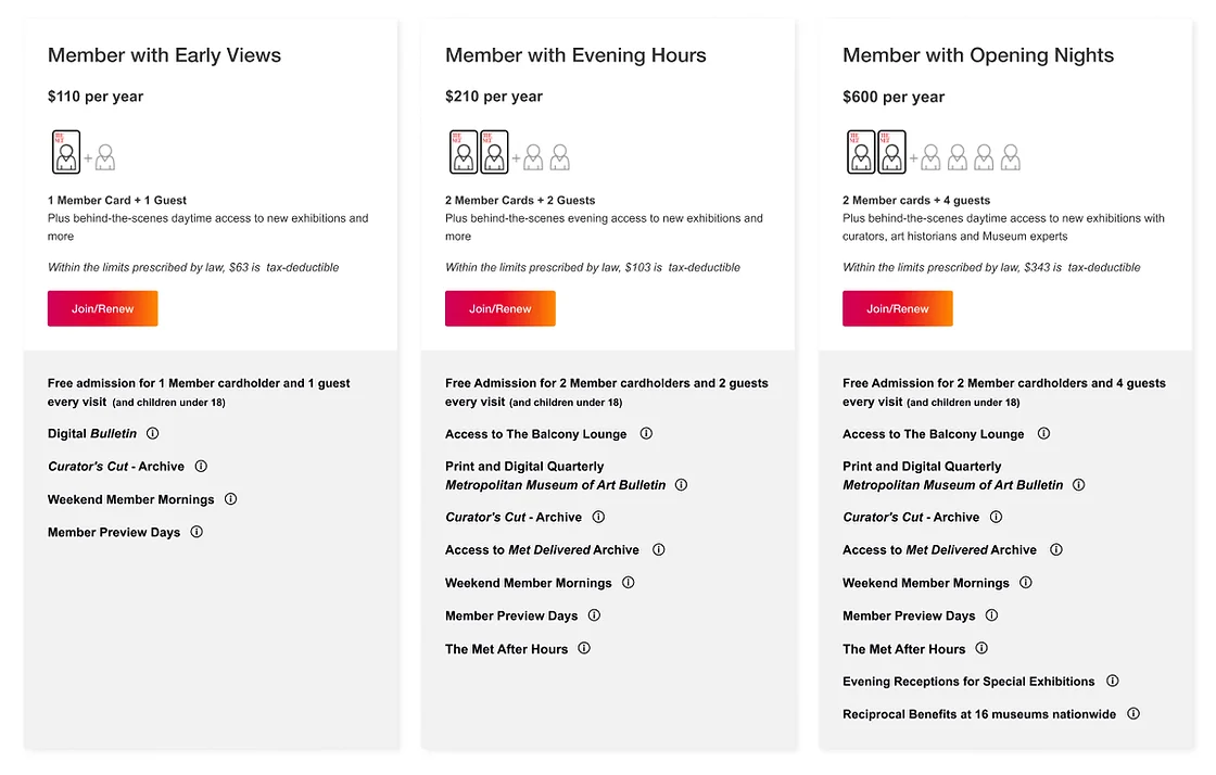
Clarity in Membership Benefits to allow users to easily compare features.​​

Comparison elements

Highlight unique benefits

Omit repeated benefits

Prioirte key benefits
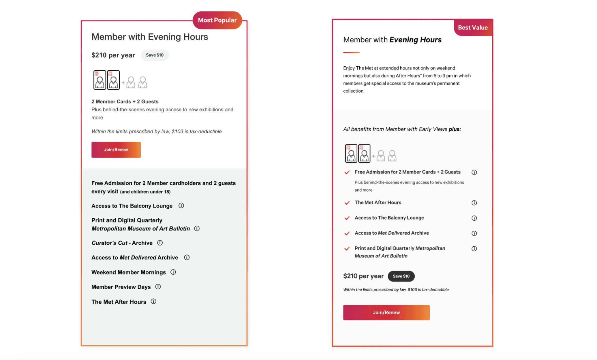
Connected

Highlighting Memberships for Making Users feel more connected.​​

Visual emphasis

Popular and best value tags

Cost justification

Solutions

Recommendation Hi-Fi:

Based on the feedback provided by the users, several overarching problems can be identified. Here are the corresponding recommendations:

Membership Navigation

Basic Tiers

To enhance user navigation, each membership tier should be clearly delineated in the tab bar with distinctive visual designs such as contrasting colors and bold fonts. ​​​

Membership Navigation

Basic Tiers

To enhance user navigation, each membership tier should be clearly delineated in the tab bar with distinctive visual designs such as contrasting colors and bold fonts. ​​​

Membership Navigation

Basic Tiers

To enhance user navigation, each membership tier should be clearly delineated in the tab bar with distinctive visual designs such as contrasting colors and bold fonts. ​​​

Membership Navigation

For Patrons

To ensures that options like Apollo, Met Family, and Patron circles within the premium tab are easily distinguishable. Incorporating concise and descriptive titles further aids in quick comprehension and differentiation, optimizing the user experience.

Membership Navigation

For Patrons

To ensures that options like Apollo, Met Family, and Patron circles within the premium tab are easily distinguishable. Incorporating concise and descriptive titles further aids in quick comprehension and differentiation, optimizing the user experience.

Membership Navigation

For Patrons

To ensures that options like Apollo, Met Family, and Patron circles within the premium tab are easily distinguishable. Incorporating concise and descriptive titles further aids in quick comprehension and differentiation, optimizing the user experience.

Membership Benefits

Comparison and User-Centric Benefits

Implement feature comparison for membership tiers to aid informed decisions. Insights reveal users value benefits over price, preferring memberships offering evening hours or opening nights for their flexibility and exclusive access. Updates include prioritizing benefits like guest admissions and special event access in the descriptions, streamlining decision-making by emphasizing unique perks and aligning with user preferences from testing feedback.

Membership Highlight

Strategic Visual Cues

To guide user choices effectively, emphasize the "Member with Evening Hours" membership as it offers substantial benefits at minimal extra cost, perceived as the best value. Enhancements include bordering member cards with The Met’s color gradients for visual emphasis, adding tags to indicate popular or high-value options, and displaying savings tags to clearly show cost benefits compared to lower-tier memberships. These visual cues help users easily recognize the advantages and make informed decisions.